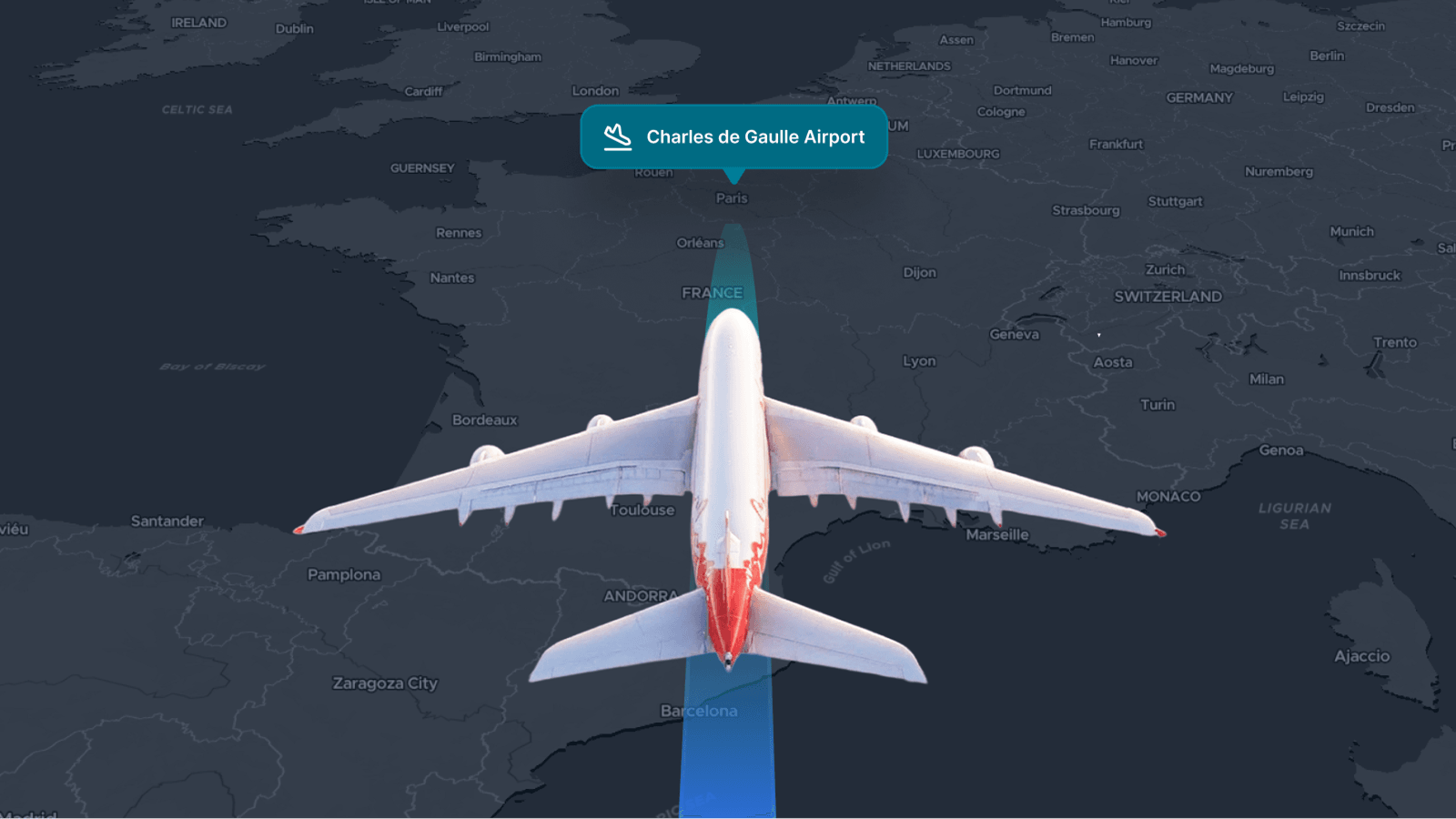
Create dynamic interactive visualizations in the browser using our SDK. Building maps with our technology has taken a leap forward with the ability to animate changes over time. We used the technology developed for weather data and made it available for any gridded raster data, GeoTiff, NetCDF, and more.
This global population density map has the usual controls to zoom and pan the map but also includes functionality to slide through time to see how the underlying data changes. You can also use the mouse pointer to find the data at a specific location.
Animated maps with WebGL
Developed for the Weather module, the SDK takes data from each time point and smoothly animates the changes at 60fps. All this visualization is handled in the web browser using WebGL technology, with the data served from MapTiler Cloud. Now you can create interactive maps showing beautifully styled data without expensive specialist software and share them from your app or website!
Creating the visualization involved three key steps, which you can read about in the following tutorials:
- Preparing data and making design decisions
- Processing the data into map tiles
- Coding and advanced data visualization
Switch to MapTiler
Our SDK offers many other great data display features, including Augmented Reality, 3D landscapes, and advanced weather animations. It also works with all the common frameworks, like React, Vue.js, Svelte, or Angular. You can change from Mapbox or MapLibre with a few lines of code.
Upgrade from Mapbox GL Change from MapLibre